

Contandem
The graphic branding design for Contandem is based on the concept of stacked containers, symbolizing the essence of the company and its business area related to logistics and transportation. The use of stacked containers in the brand symbol creates a visually powerful and recognizable image, conveying the idea of solidity, efficiency, and order.

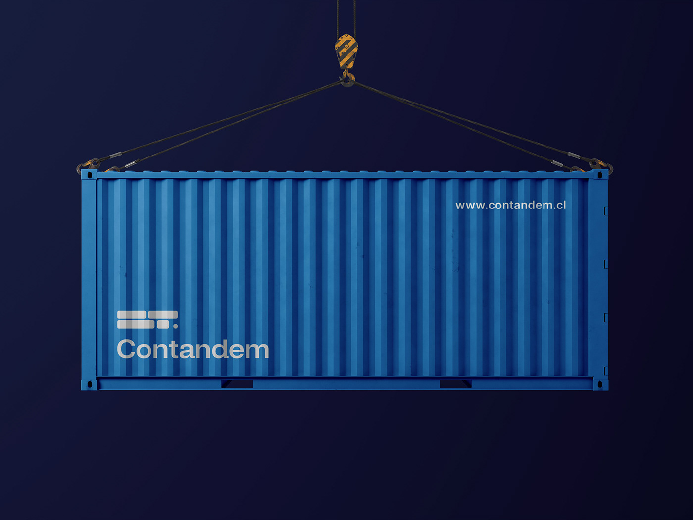

As for the colors, neutral blue tones have been chosen to represent Contandem's business area. Blue is a color that evokes trust, professionalism, and stability, which are highly valued characteristics in the logistics sector. These tones also convey a sense of seriousness and solidity, giving the brand a strong and reliable corporate image.


Furthermore, the design of the symbol also incorporates the letters "CT," representing the initials of Contandem. These letters are seamlessly integrated into the structure of the stacked containers, adding a unique element of identity and facilitating a direct association with the company's name.


In summary, the graphic branding design of Contandem uses the concept of stacked containers to visually represent the logistics and transportation industry. The incorporation of the letters "CT" in the symbol reinforces the company's identity, while the neutral blue colors convey trust and stability. Together, these elements contribute to creating a distinctive and meaningful graphic brand for Contandem.

Thanks for watching
I'm available for new projects. Let's work together!


